
by Matman
As a Marketing Major I know the importance of a solid recognisable logo and solid consistent branding. I also know how important it is to keep things cohesive especially when dealing with legacy and history.
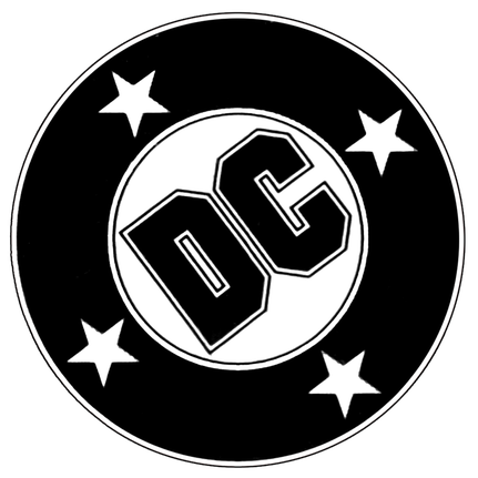
AS DC Comics approaches their latest adventure, REBIRTH, the company has announced and put out there their new logo. For me this is the fifth change since i've been collecting... with the last logo being my least favorite. The peeling back design only seemed to work for me when a character was within the letters.
So now, as designed by Jim Lee we have a return to a very simplistic style, 'DC' in a circle! The look isn't bad but there is something I don't like about it and i can't quite put my finger on it.
Designer and DC big wig Jim lee has stated that the logo incorporates the logos of the big three; Superman, Batman and Wonder Woman. As Lee posted, "The nooks and angles are meant to evoke the Superman ‘S’, the Wonder Woman ‘WW’ emblem and the Bat logo."
I don't quite see it but what I do see is a better 'branding' than the last one. Until they bring back the DC Bullet... it'll have to do.
As a Marketing Major I know the importance of a solid recognisable logo and solid consistent branding. I also know how important it is to keep things cohesive especially when dealing with legacy and history.
AS DC Comics approaches their latest adventure, REBIRTH, the company has announced and put out there their new logo. For me this is the fifth change since i've been collecting... with the last logo being my least favorite. The peeling back design only seemed to work for me when a character was within the letters.
So now, as designed by Jim Lee we have a return to a very simplistic style, 'DC' in a circle! The look isn't bad but there is something I don't like about it and i can't quite put my finger on it.
Designer and DC big wig Jim lee has stated that the logo incorporates the logos of the big three; Superman, Batman and Wonder Woman. As Lee posted, "The nooks and angles are meant to evoke the Superman ‘S’, the Wonder Woman ‘WW’ emblem and the Bat logo."
I don't quite see it but what I do see is a better 'branding' than the last one. Until they bring back the DC Bullet... it'll have to do.


 RSS Feed
